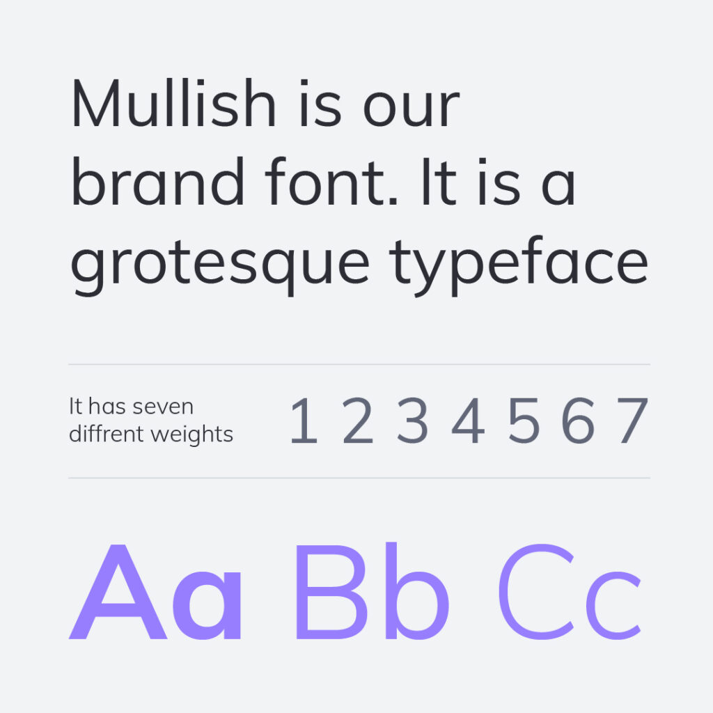
Typography for marketing assets
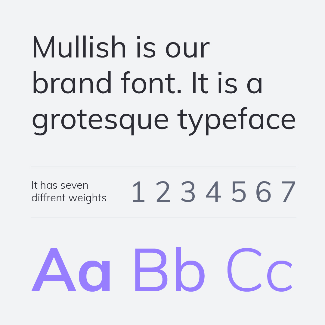
Our primary typeface, Mullish, is chosen for its clarity and effectiveness when applied correctly.
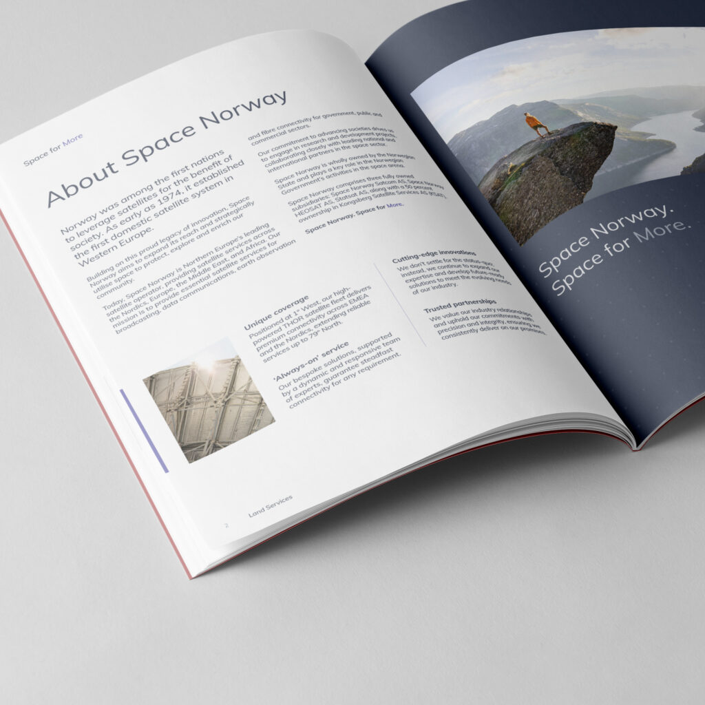
Typography is a core element of our brand toolkit, so it’s essential to use it consistently across all marketing assets. We establish a clear text hierarchy to emphasize key messages and guide readers through content. This hierarchy is created through considered size variations and the strategic use of color to highlight important words, rather than relying on multiple font weights.
By prioritising consistency and simplicity, our communications remain clean, professional, and easy to understand.

Typography for office documents
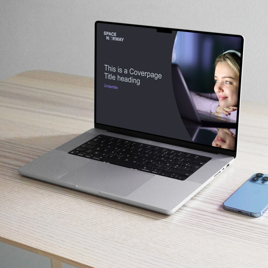
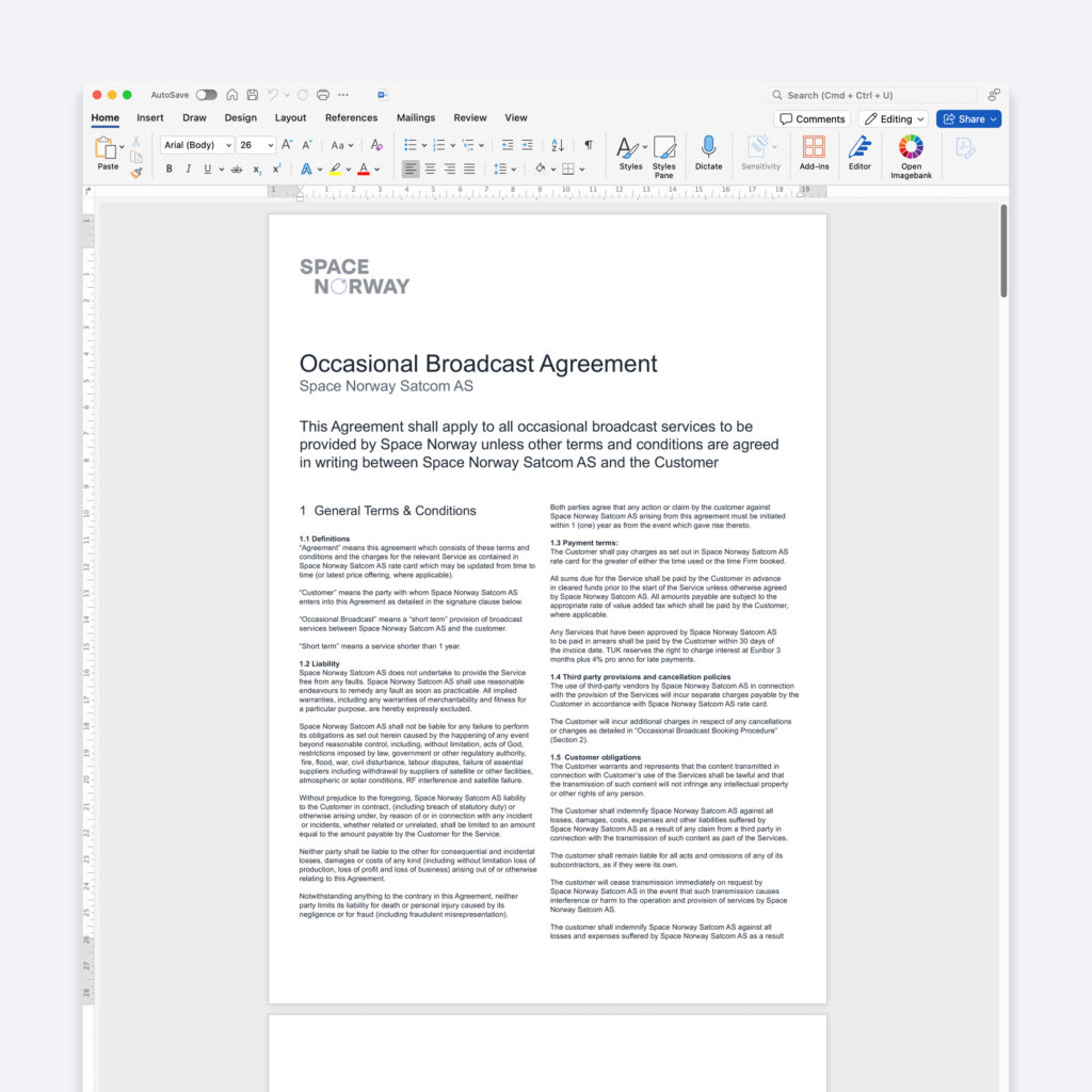
Our primary Microsoft Office typeface is Arial, a widely used standard font that is pre-installed on all users’ computers. The same typographic principles that apply to Mullish also apply when using Arial.
A predefined typographic hierarchy is built into our templates and should be used without modification.
If your needs are not covered by the existing templates, apply these same principles to ensure a consistent and professional appearance across the organisation.