The Space Norway logo is a distinctive representation of our brand. It encapsulates our mission and core business, reflecting our focus on advancing satellite connectivity and space technology.
Our logo is essential for establishing a strong and consistent brand presence. Altering any part of the logo or its elements, or using unauthorised colours, is strictly prohibited.
Typography: The logo uses Messina Sans Black, a strong and modern typeface that conveys reliability and innovation.
Orbit symbol: The unique orbit symbol represents our core business, symbolising how we harness space for security and connectivity.
Combination: The logo seamlessly integrates our company name and the orbit symbol, while honouring our Norwegian heritage, to create a cohesive and recognisable brand identity.
Positive: The positive dark grey logo is the primary variant and should be used on all light coloured backgrounds. This is the preferred logo variant and should be used whenever possible.
Negative: The negative light grey logo is designed for use on dark backgrounds where the positive variant does not provide sufficient contrast.
Black & white: These monochrome logo variants may be used as exceptions on dark and light backgrounds, respectively, in situations where colour usage is restricted (for example, in black and white print or certain digital environments).
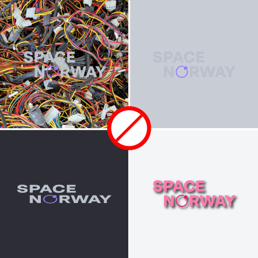
Always use the logo variant that provides maximum legibility and contrast, and avoid placing the logo on complex or low contrast backgrounds.
Our logo is our primary brand identifier and should always be legible, impactful, and presented at its best.
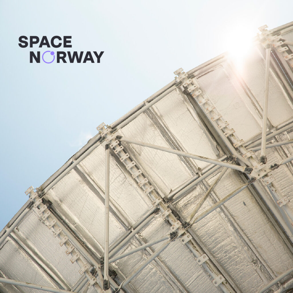
Preferred placement: The preferred placement for our logo is in the top left corner of a document or marketing asset. If the top left corner isn’t suitable, use one of the other three corners instead.
Alternative placement: In some cases, we may give the logo more emphasis by making it larger and placing it in the centre. This usage requires a good understanding of composition and design hierarchy.
Distance and clear space
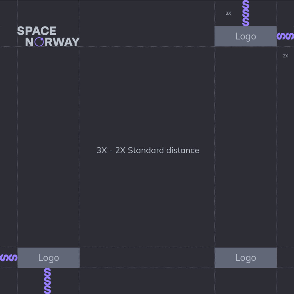
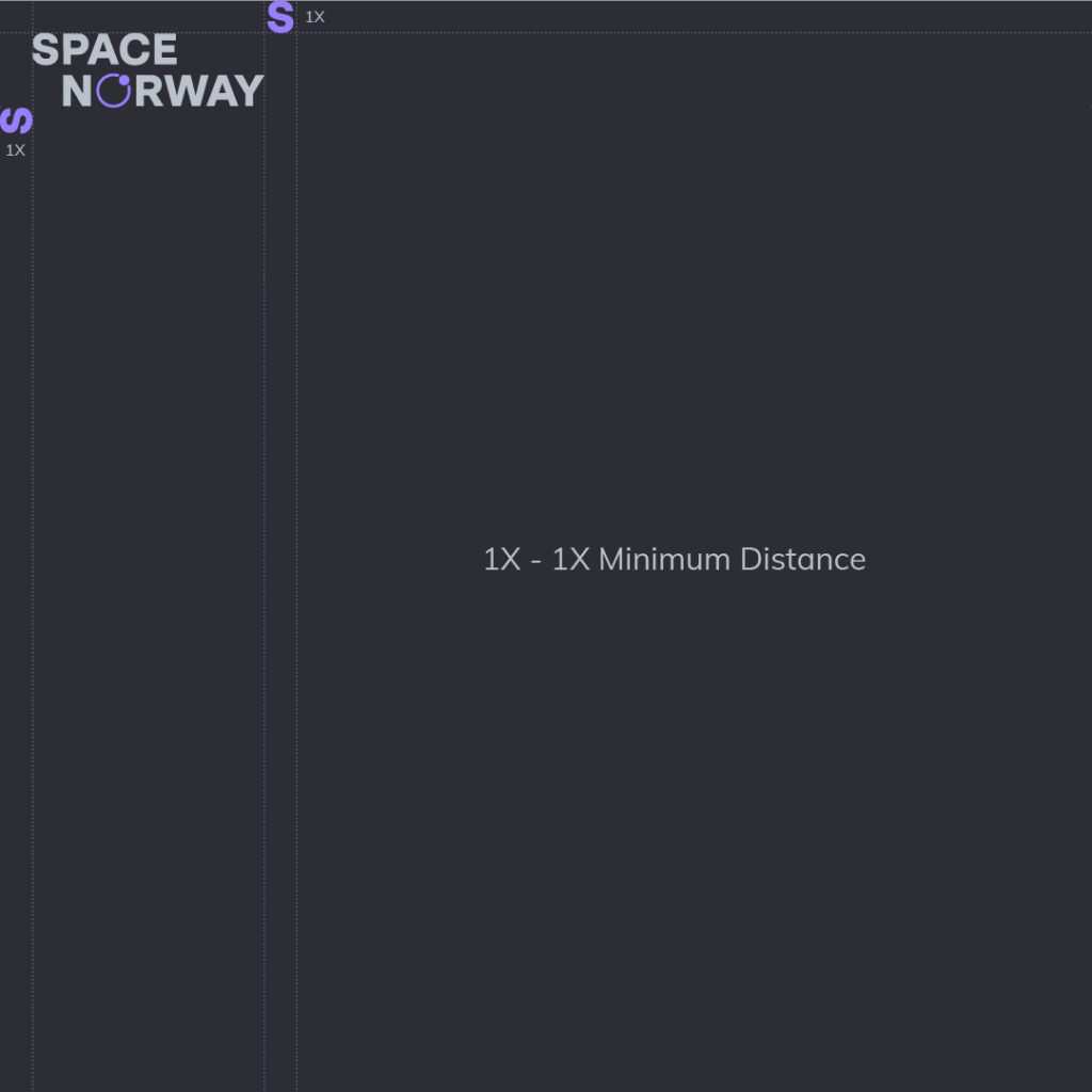
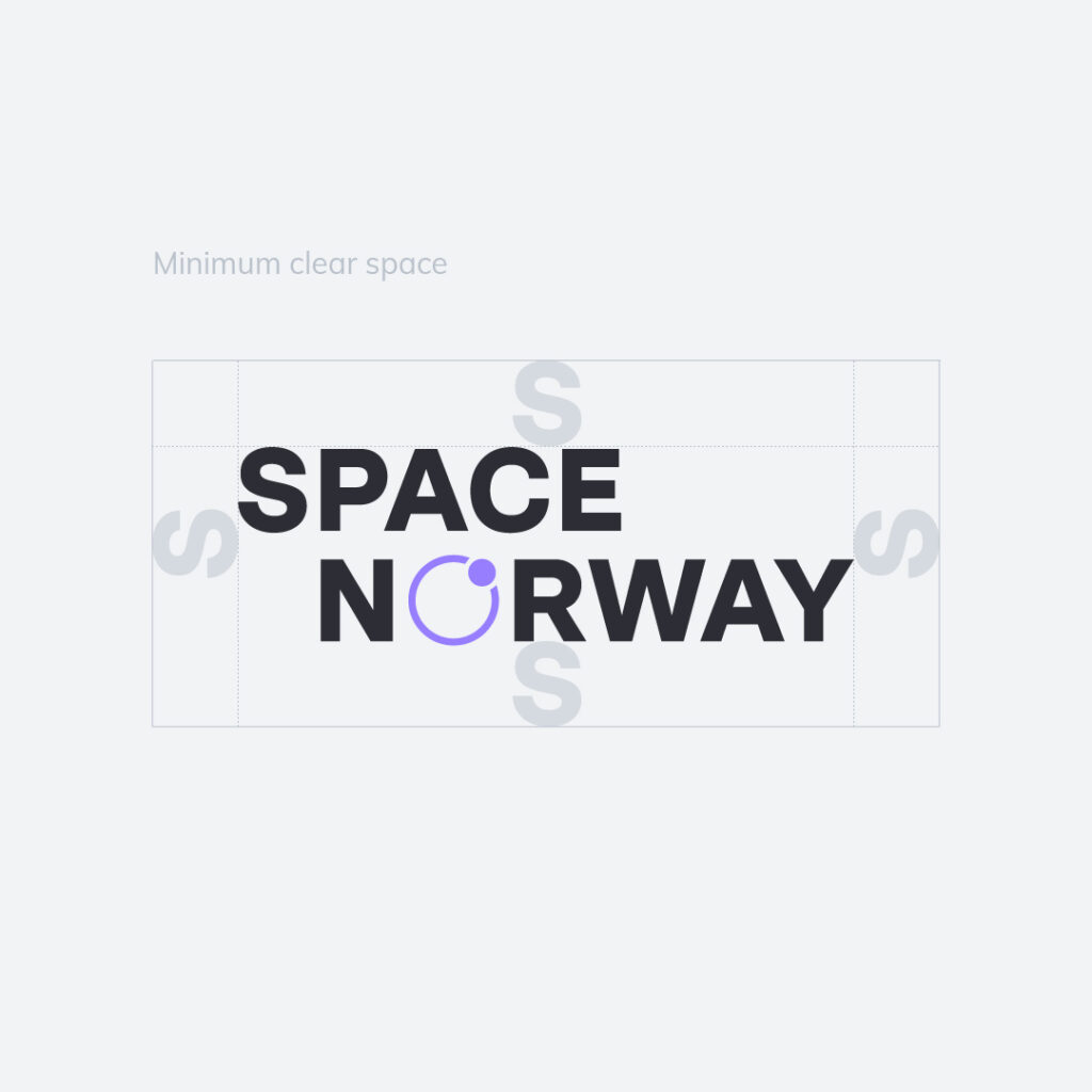
The size of the “S” in our logo is used as a unit of measurement to define the clear space and distance from edges.
Standard distance (3×2): Ideally, the logo should have three times as much space from the top or bottom as it has from the sides. This ensures enough room for the logo to breathe and maintain its visual impact.
Minimum distance (1×1): For designs with limited space, use the 1×1 measurement as the minimum safe distance.
Clear space: There must always be clear space around the logo to emphasize its importance and increase readability. No other text or graphics should intrude into this area.
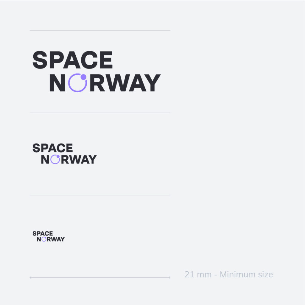
Logo size: Do not reduce the logo below the set minimum size of 21 mm to ensure proper reproduction and visibility.
Logo on images: When placing the logo on an image, avoid distracting backgrounds or those with low contrast to keep the logo clear and visible.
Logo integrity: Maintain the integrity of the logo by not stretching it, changing its colour, or applying any effects to ensure our logo remains true to our brand identity.
The Orbit symbol vividly illustrates Space Norway’s core business, encapsulating our focus on satellite connectivity and space technology.
This iconic symbol has been an integral part of the company’s visual identity and heritage over time, representing our enduring commitment to advancing the frontiers of space.

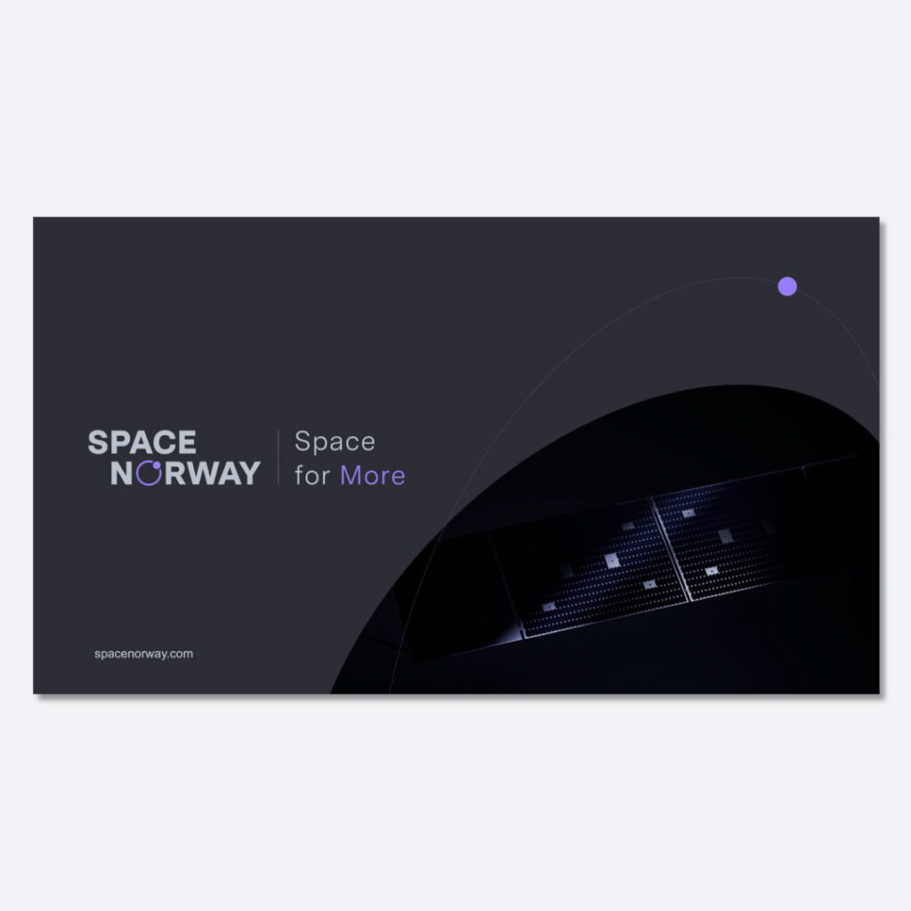
Space Norway’s tagline “Space for More” complements the logo and underlines our commitment to exploring new horizons and expanding possibilities.
By incorporating the tagline, we reinforce our dedication to providing more opportunities, more connectivity, and more advancements in the field of space technology.
When to use
At Space Norway, the logo featuring our tagline is used as a secondary or complementary logo. This version is ideal for use in various contexts where we aim to highlight our brand’s vision. Appropriate uses include:
The animated logo adds a dynamic and modern expression to our brand identity and is ideal for digital platforms such as websites, social media, video, advertising, and presentations.
Use the animated logo at the beginning or end of videos or presentations, in digital advertising, or on interactive media to capture attention and enhance brand engagement.
Avoid overusing the animation to maintain its impact and effectiveness.