Orbit graphic
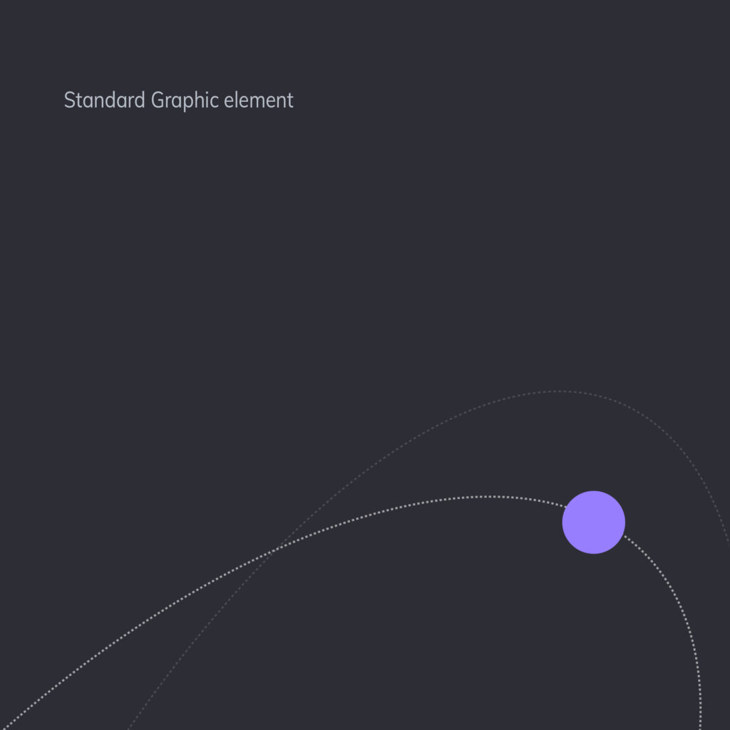
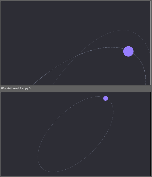
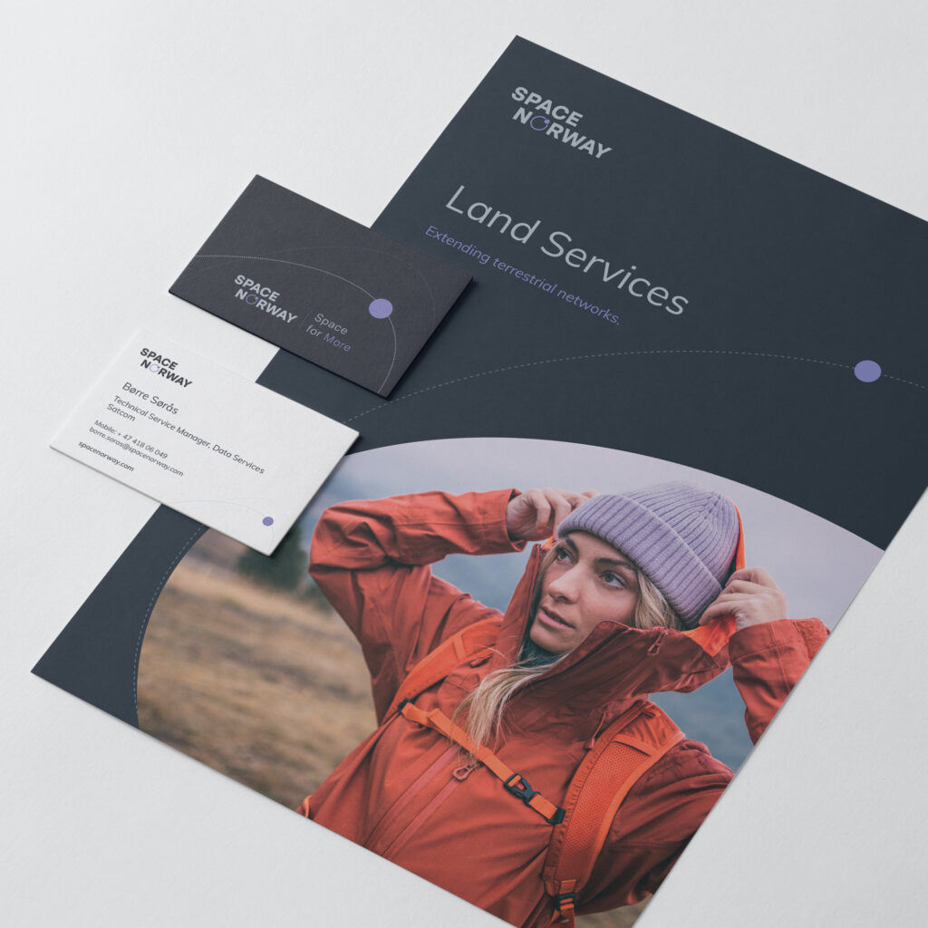
Our main visual element is inspired by a satellite in orbit and derived from our logo symbol. It consists of an orbital path with a dot, forming the foundation for many of our layouts.
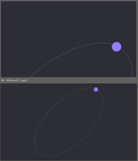
The standard version uses two dotted paths and a single dot, while a simplified version with one path is also available. Both can be used as subtle graphic details or as part of more illustrative compositions, as shown in the examples.
Elliptical image crops
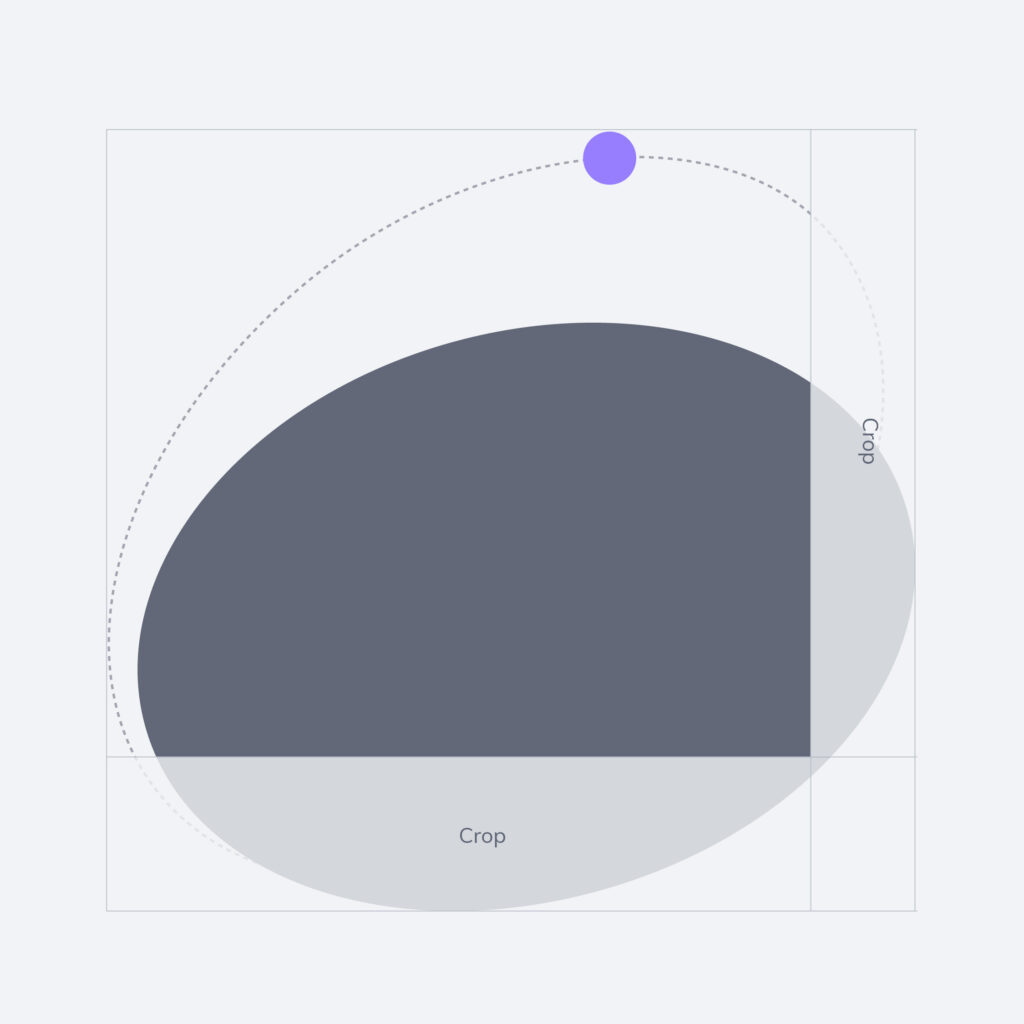
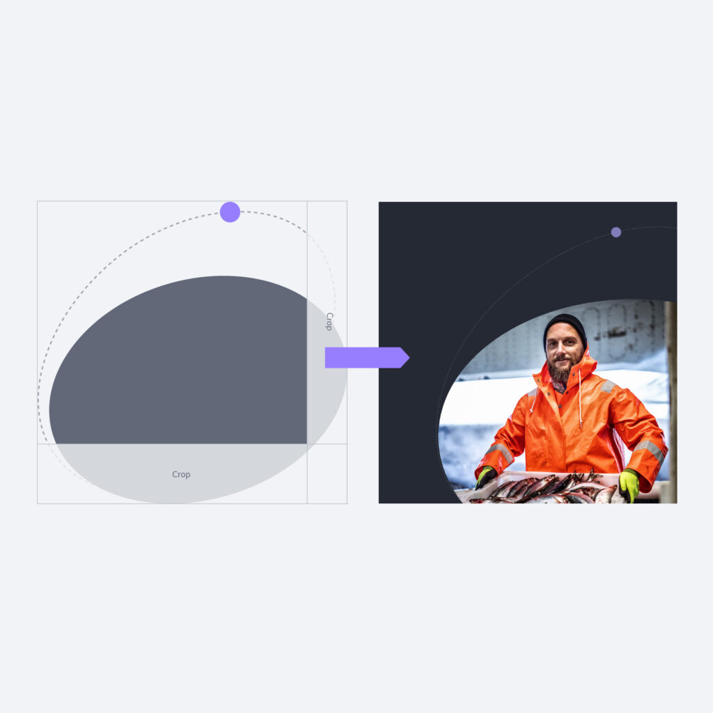
The elliptical orbit shape is also used to crop images, giving them a distinctive look and reinforcing our brand expression.
Star pattern
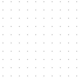
We also use a star pattern sparingly to add light texture to backgrounds, without competing with the main content or making layouts feel busy.


Base shape
The orbit shape can be rotated or stretched to suit the layout, and the dot can be placed along the path in a way that supports the overall composition.
Combined with imagery
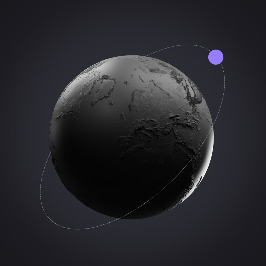
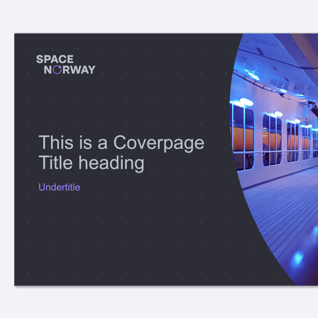
The orbit shape is often combined with masked images and other graphic elements, particularly on cover pages and chapter dividers in PowerPoint. Used this way, it creates layouts that are instantly recognisable as part of the Space Norway brand.
When combining the orbit with imagery:
Placement examples
The placement examples show preferred uses of the standard graphic element. It is intended as a subtle accent that supports the layout, without dominating or distracting from the main content.